Step-by-step guide · 12 min read
How to add a parallax effect in WordPress – with real depth
Parallax makes things further away move more slowly as you scroll, which gives a flat page depth. The usual WordPress trick, a “fixed background”, is a different effect – and on iPhones it simply scrolls with the page. In Midground you use a Parallax section for one picture, or a Depth group for layers at depths from −100 to 100.

Sleep through the engines.
Quiet mode was tuned on the night flight from Oslo to Tokyo. Twice.
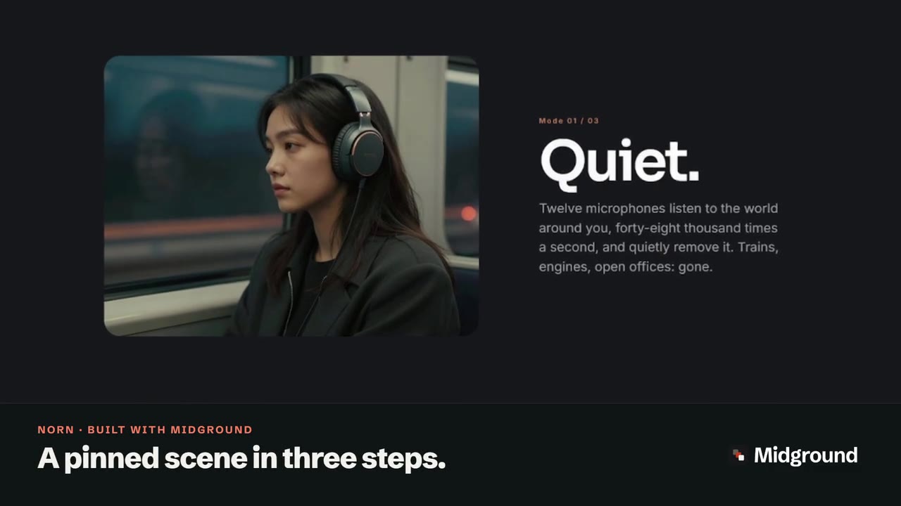
Depth group · three layers
Move your pointer over it.
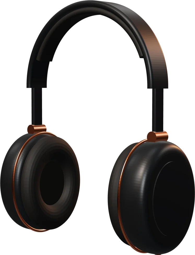
The big letters sit deep behind, the headphones in the middle and the facts in front. Each layer has its own depth, so they move at their own pace as you scroll – and follow the pointer.
ONE
Read the transcript
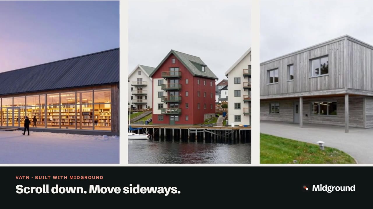
On screen: “Depth, without code.”, then “Layers move at their own pace.” The Norn demo page scrolls at an even speed while the photograph of a passenger asleep in a window seat at sunrise slides by more slowly than the heading “Sleep through the engines.” in front of it. Then WordPress’s Pages list, where “Edit with Midground” opens the editor, under the caption “Yes, this is WordPress.”, and an end card: “Try it in your browser · midgroundwp.com/try”.
What is parallax scrolling? Three kinds you’ll meet in WordPress
From a train window, the fence rushes past while the mountains barely move. That difference in speed is parallax, and your eye reads it as distance. Parallax scrolling uses the same cue on a page: things further back move more slowly than the text in front.
“Fixed background” – a different effect, and it doesn’t work on iPhone
Many tutorials reach for a fixed background: the Fixed background setting on WordPress’s Cover block, or a theme option that uses background-attachment: fixed. The picture stays still while the page slides over it – a window rather than depth, as if the picture were infinitely far away.
It also fails on iPhones and iPads: Safari recognises the fixed value but ignores it (see caniuse), so the picture simply scrolls with the page. The Cover block itself turns its fixed background off there, and for visitors who ask for reduced motion.
Background parallax: one picture, slower than the page
Here the picture really moves, just more slowly than the content in front. In Midground that’s the Parallax section; the Hero has it built in as Image depth (parallax), and any picture can get Parallax drift on its Motion tab.
Layered depth: several layers at different distances
A Depth group stacks layers – big type, cut-out pictures, short facts – and gives each a depth from −100 to 100. Near layers pass faster than far ones, and on a computer they can also follow the mouse. If the product itself should turn, you need a 3D model that turns as you scroll.
When parallax helps – and when to skip it
Use it where a page should pause: the opening picture, a change of chapter, a product that deserves a moment – like “Sleep through the engines.” between Norn’s gallery and its reviews. Skip it for long reading, forms and checkout, and don’t give every section depth: it reads as depth because the rest of the page is still. For a story told in stages, use a pinned scene in steps; Apple-style scroll pages in WordPress shows how the effects combine.
How to add a parallax background in Midground
The demo’s first part copies “Flight” from the Norn demo site.
Step 1: Add a Parallax section
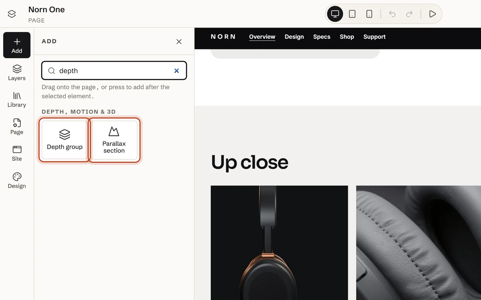
Open Add, find Parallax section under Depth, motion & 3D and drag it onto the page. It arrives with a heading, at least 70 % of the screen tall (60 % on phones); Norn’s is 95 %.
Step 2: Choose the picture and its depth
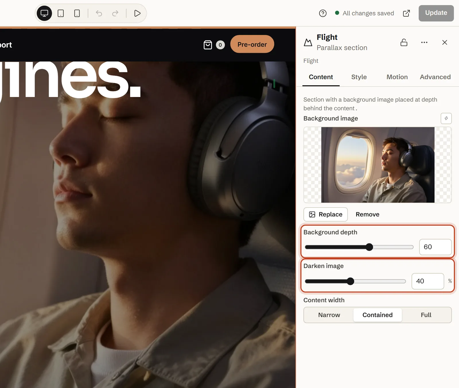
On the Content tab, choose the Background image – a passenger asleep in a window seat at sunrise, in our demo – and leave Background depth at 60; higher values sit further back and move more slowly.
Step 3: Darken the picture and set the width
Set Darken image so the text stays readable – 40 % in our demo, 30 % by default – and pick a Content width: Narrow, Contained (Norn’s choice) or Full.
Step 4: Add the content and preview it
Write the heading and a line of text; Norn’s heading, “Sleep through the engines.”, has Rise in on its Motion tab, or you can reveal a heading word by word. Then choose Motion preview → Show motion at the top and scroll the canvas.
At the top of a page, use a Hero instead: its Image depth (parallax) works the same way, and its Background image loads with high priority.
A lighter touch: a scroll effect on one picture
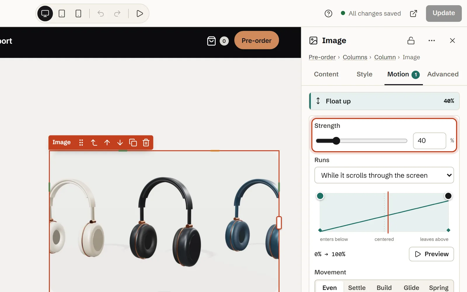
For a picture that isn’t a background, select it, open Motion and choose Parallax drift (slower than the page) or Float up (a little faster) under While scrolling. Norn’s three-colour picture uses Float up at 40 % Strength.
How to build real depth with a Depth group
The second part rebuilds Norn’s “Headphones in depth”.
Step 1: Add a Depth group
Drag Depth group from Add onto the page. It comes with three layers to start from – far at 70, middle at 25, near at −35 – and Add layer adds more. The opening of our fjord story is a Depth group: the sky, three mountain ranges, the water and a ferry, at depths from 95 to −30.
Step 2: Fill the layers
Put the word “ONE” in huge letters in the far layer, a cut-out of the headphones in the middle and three short facts in front. Vertical placement and Horizontal placement position each layer’s content; a Layer image fills the whole layer, and transparent PNG, WebP or SVG cut-outs give the clearest depth.
Step 3: Give each layer a depth
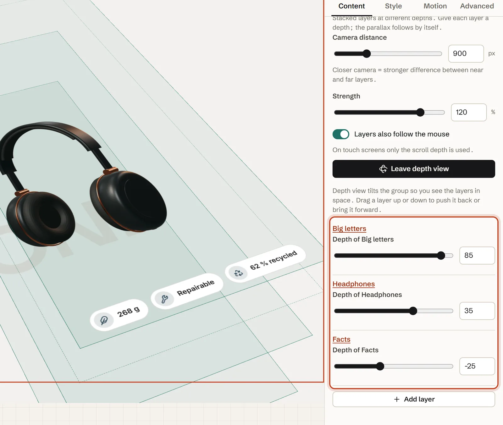
Set Depth on each layer, or all at once in the group’s settings: 85 for the letters, 35 for the headphones and −25 for the facts in our demo.
Step 4: Set the camera and the strength
Camera distance is how far away the viewer stands – closer means a bigger difference between near and far – and Strength scales the whole movement. Our demo uses 900 px and 120 %, with Layers also follow the mouse turned on.
Step 5: Check the layers in Depth view
Click Depth view: the group tilts so you see the layers in space, each labelled with its name and depth. Drag a layer up to push it back or down to bring it forward, then click Leave depth view or press Esc.
The settings, explained
Read the numbers as distances: each step of depth is 4 px behind the page (or in front of it, if negative), and Midground works out the speed from where the camera stands. On a desktop screen, Norn’s picture at depth 60 moves at about four-fifths of the scroll speed, the letters at 85 at about two-thirds, and the facts at −25 about 15 % faster than the page.
Parallax section
| Setting | What it does | In our demo |
|---|---|---|
| Background image | The picture behind the content, always treated as decoration | A passenger asleep in a window seat at sunrise |
| Background depth | 0–100 (default 60): how far back the picture sits; further back is slower, 0 scrolls with the page | 60 |
| Darken image | 0–90 % (default 30 %): a dark shade so the text stays readable | 40 % |
| Content width | Narrow, Contained or Full | Contained |
| Motion on the heading | Any effect from the Motion tab | Rise in |
Depth group and layers
| Setting | What it does | In our demo |
|---|---|---|
| Camera distance | 300–2400 px (default 1000 px): closer makes near and far layers differ more | 900 px |
| Strength | 0–150 % (default 100 %): scales all the depth movement in the group | 120 % |
| Layers also follow the mouse | A little pointer movement on computers; touch screens use scroll depth only | On |
| Depth (each layer) | −100 to 100 (default 0): positive is further back and slower, negative in front and faster | Big letters 85 · Headphones 35 · Facts −25 |
| Layer image · Image is decorative | Optional picture filling the layer · on by default: screen readers skip it | Not used: the headphones are an Image element with alternative text |
On phones and tablets
Parallax pictures and depth layers move less on smaller screens: 85 % of the movement on tablets and 60 % on phones, set by Default strength on tablets and Default strength on phones under Design → Motion. Phones are screens under 768 px wide and tablets under 1200 px; effects from the Motion tab have their own Per device settings.
- Touch screens get the scroll depth only – the layers don’t try to follow a finger.
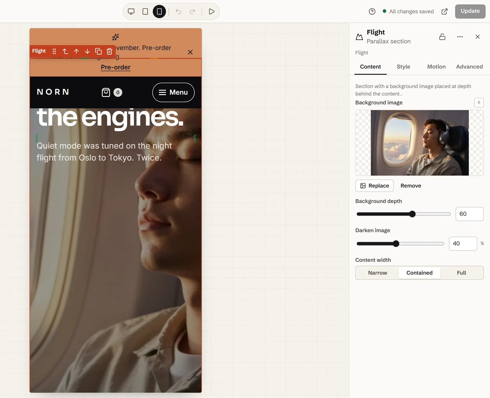
- The picture is made taller than its section by the distance it travels, so its edges never show. On a tall phone screen only a slice of a landscape picture is visible, so keep the subject near the centre.
- Nothing relies on
background-attachment: fixed, so the effect doesn’t switch itself off in Safari on iPhone. We checked it in WebKit at phone size; try it on your own phone before launch. - At phone size in the editor, with Show motion on, the canvas plays the gentler version.
Accessibility: motion sickness and reduced motion
For people with vestibular disorders, large movement on screen can bring on dizziness, nausea or migraine. The W3C names parallax scrolling as motion that is often not essential, and WCAG 2.3.3 (level AAA) asks that motion triggered by interaction can be turned off. The switch most visitors already have is their device’s reduced-motion setting.
- Visitors who ask for reduced motion get a calm page automatically: every layer and picture stays at rest and text with an entrance effect is simply shown. The page follows at once if they change the setting.
- Site-wide motion under Design → Motion can give everyone the calm version (Reduced for all) or turn motion Off.
- The parallax picture is always decorative and hidden from screen readers, so never put information only in it. Layer pictures have Image is decorative on by default; a picture that carries meaning, like Norn’s headphones, belongs in an Image element with Alternative text.
- Layers stack by depth, not by their order in Layers, so you can order them for reading aloud.
- Check that the composition still works at rest with Motion preview → Preview with reduced motion.
The effects only listen to the scroll and never take it over, so the page scrolls at the visitor’s own speed.
Performance: why transform-based parallax stays smooth
A parallax effect that changes background-position makes the browser repaint the picture on every frame. Midground moves it with a CSS transform, which the browser can shift without repainting. The motion engine uses one passive scroll listener and one animation-frame loop, measures positions once (and again on resize), writes a style only when it changes and sets will-change only near the screen. On our demo, that is about 12.5 KB of JavaScript (compressed).
The real cost is pictures. A parallax picture is often the largest thing on screen, so it can be the element measured for Largest Contentful Paint:
- Export it as WebP or JPEG at the size it’s shown and aim for under about 200 KB; WordPress hands smaller versions to smaller screens.
- At the top of a page, use a Hero with Image depth (parallax), whose picture loads with high priority.
- Use transparent WebP rather than PNG for cut-outs, and keep to a few layers – three, as in our demo, are plenty.
Common mistakes (and fixes)
It doesn’t move on iPhone
Usually it’s a fixed background, which iPhones ignore – switch to a Parallax section. If a Midground section stands still too, check whether the phone asks for reduced motion (Settings → Accessibility → Motion on an iPhone).
The picture’s edge shows
The Parallax section and Layer image make room for the movement themselves, so an edge usually means a scroll effect such as Parallax drift on a picture that fills a box. Move the picture into a Parallax section, or give it space to move.
Text is hard to read on the picture
Raise Darken image – try 40–60 % – or choose a calmer picture. Check it while the section scrolls by, because different parts of the picture pass behind the text.
It stutters
Look for a picture far larger than it’s shown, a stack of big PNG cut-outs, or several moving sections on one screen. Shrink the pictures, cut layers, and test at phone size in the editor and on a real phone.
Everything on the page moves
Keep depth to one or two places per page, and let the reading text stand still.
Let an AI agent build it
From Midground Builder 1.2, every editor step is a WordPress ability, so Claude Code, Cursor, Codex or another MCP client can do all of the above through the WordPress MCP Adapter. Here’s how to let an AI agent build it; the agent works as a WordPress user you choose, and every change is a revision you can go back to. For example:
Prompt for your AI agent
Turn the section “Sleep through the engines.” into a Midground Parallax section with flight.jpg at Background depth 60 and Darken image 40 %. Under it, add a Depth group with three layers: “ONE” in big letters at depth 85, the headphones cut-out at 35 and three short facts at −25. Save it as a draft and send me the preview link.
The code way: CSS-only, scroll-driven animations or JavaScript
Without a builder there are three routes, each with a catch:
- CSS-only 3D: a scroll container with
perspectiveand a background pushed back withtranslateZ(). No JavaScript, but the page must scroll inside that container instead of the window, which most themes don’t expect. - Scroll-driven animations:
animation-timelineties a CSS animation to the scroll. Chrome and Edge (from version 115) and Safari 26 run it; at the time of writing, Firefox’s regular release doesn’t yet. - JavaScript: a passive scroll listener and a
requestAnimationFrameloop that set atransform– the approach most parallax scripts take.
Whichever you pick, make the picture bigger than its box, respect reduced motion and leave background-attachment: fixed alone. A scroll-driven version:
.my-parallax {
  position: relative;
  overflow: hidden;
  isolation: isolate;
  view-timeline-name: --my-parallax;
}
.my-parallax > img {
  position: absolute;
  inset: -15% 0 auto;
  width: 100%;
  height: 130%;
  object-fit: cover;
  z-index: -1;
}
@supports (animation-timeline: view()) {
  @media (prefers-reduced-motion: no-preference) {
    .my-parallax > img {
      animation: my-drift linear both;
      animation-timeline: --my-parallax;
    }
  }
}
@keyframes my-drift {
  from { transform: translateY(-10%); }
  to { transform: translateY(10%); }
}
Or skip the code: get the free beta licence and build it in the editor.
Questions about the parallax effect
Why doesn’t my parallax background work on iPhone?
Many WordPress parallax backgrounds are really fixed backgrounds (background-attachment: fixed), which Safari on iPhone and iPad ignores, so the picture just scrolls with the page. Midground moves the picture with a CSS transform instead. If a Midground section stands still on a phone, check whether the phone asks for reduced motion.
What’s the difference between a parallax section and a depth group?
A Parallax section has one background picture that moves more slowly than the content in front of it. A Depth group stacks several layers – text, cut-out pictures, shapes – and gives each its own depth, so near layers pass faster than far ones.
Can parallax make people feel sick?
Yes. Large movement can trigger dizziness, nausea or migraine in people with vestibular disorders. Visitors who ask their device for reduced motion get a calm page from Midground, with every layer at rest, and tablets and phones get 85 % and 60 % of the movement by default.
Does parallax hurt SEO or page speed?
Not by itself: the text stays real text, and the movement runs on one small script – about 12.5 KB of JavaScript (compressed) on our demo. What can hurt is a heavy picture at the top. Size it for the screen, and at the top of a page use a Hero, whose background image loads with high priority.
Can the layers follow the mouse too?
Yes. Turn on Layers also follow the mouse in the Depth group: far layers drift a little against the pointer and near layers with it. On touch screens only the scroll depth is used.
Can I add parallax with the block editor (Gutenberg)?
Only roughly. The Cover block’s Fixed background keeps the picture still while the page slides over it – a window, not depth – and WordPress turns it off on iPhones, iPads and for reduced motion. For real parallax, build a Parallax section in Midground, save it as a component and place it with the Midground section block.
Do I need Elementor or a parallax plugin?
Not with Midground: the Parallax section and the Depth group are part of its visual editor. It also works next to your current theme: build the section in Midground, save it as a component and place it with the Midground section block or its shortcode.
How strong should parallax be?
Subtle. Our demo uses a Background depth of 60 for the picture and 85, 35 and −25 for the layers, with the group at 120 % Strength. If people notice the effect before the content, turn it down.
About the author. Pelle Nilsen makes Midground – a solo developer in Norway. Every demo in this guide was built in the same editor you can open in your browser. Questions or corrections: hello@midgroundwp.com. More about Midground.
Take this demo apart in your browser
Remix opens the editor with a full copy of the Norn demo site, in your browser – no sign-up, nothing to install. Change the settings from this guide and watch what happens.
More guides