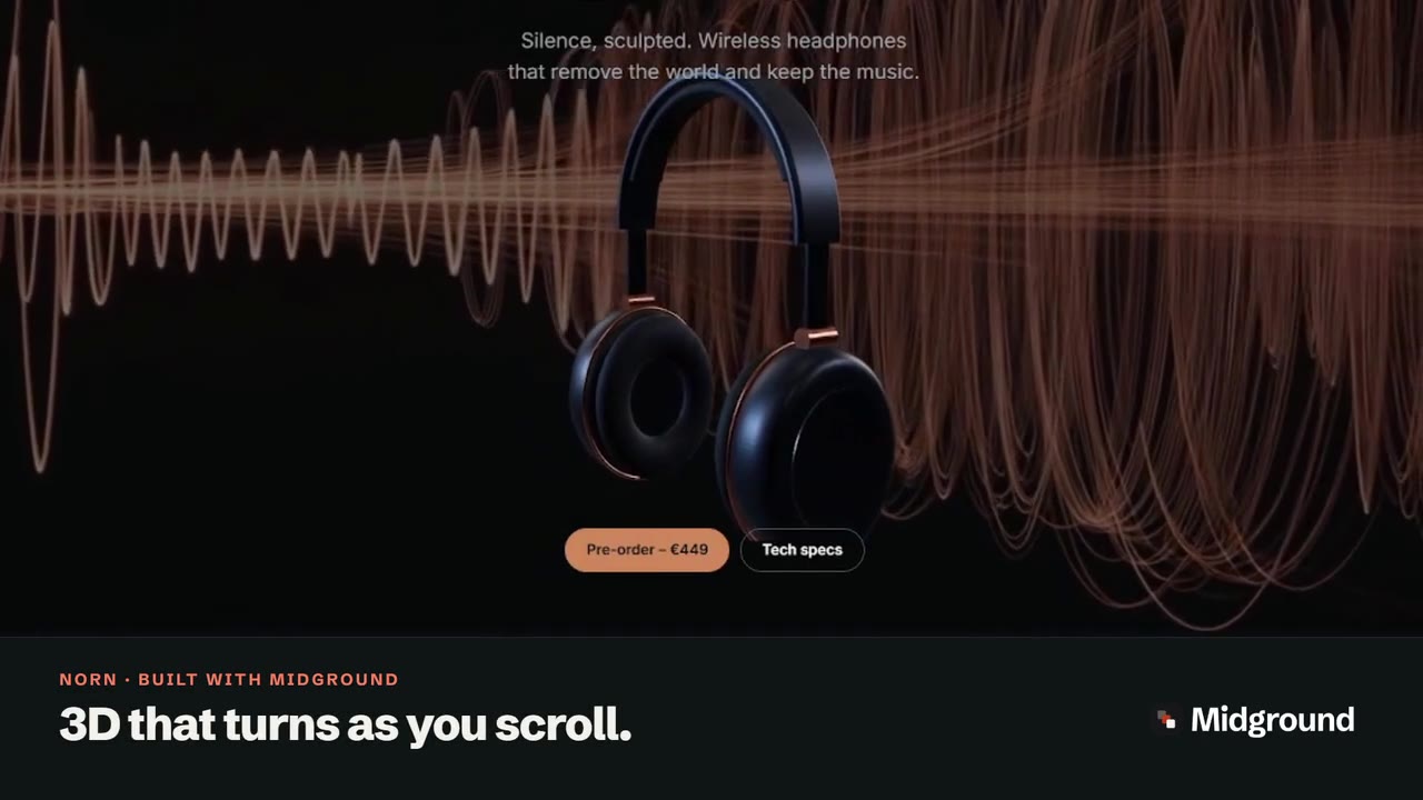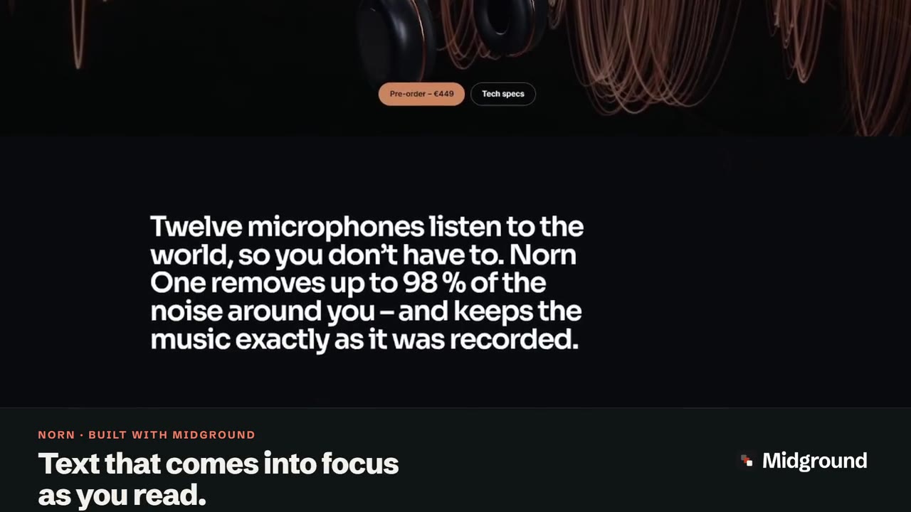
Step-by-step guide · 12 min read
Horizontal scroll in WordPress: scroll down, move sideways
A horizontal scroll section holds a row of panels on screen while the visitor scrolls down, and moves the row sideways instead. In Midground it’s one element, the Horizontal sequence: add cards, set the panel width, and choose what phones get – a swipe row by default. No code, no GSAP.
Selected work
Scroll down to move sideways →
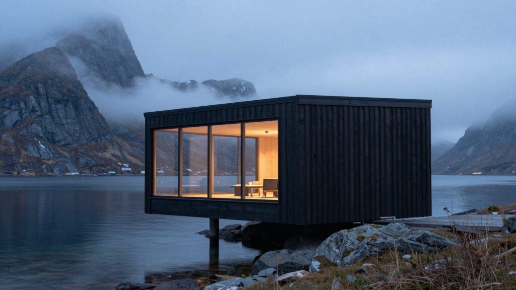
Sea Cabin
Hitra · 2025

Havnvik Library
Havnvik · 2024
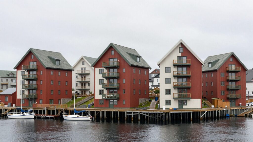
Kaikanten Housing
Bergen · 2023
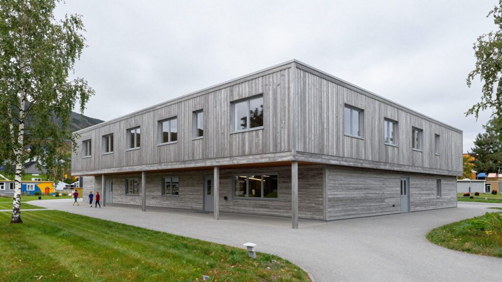
Birkely School
Voss · 2022
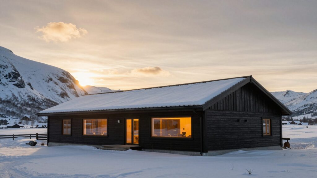
Fjellmo Lodge
Fjellmo · 2021
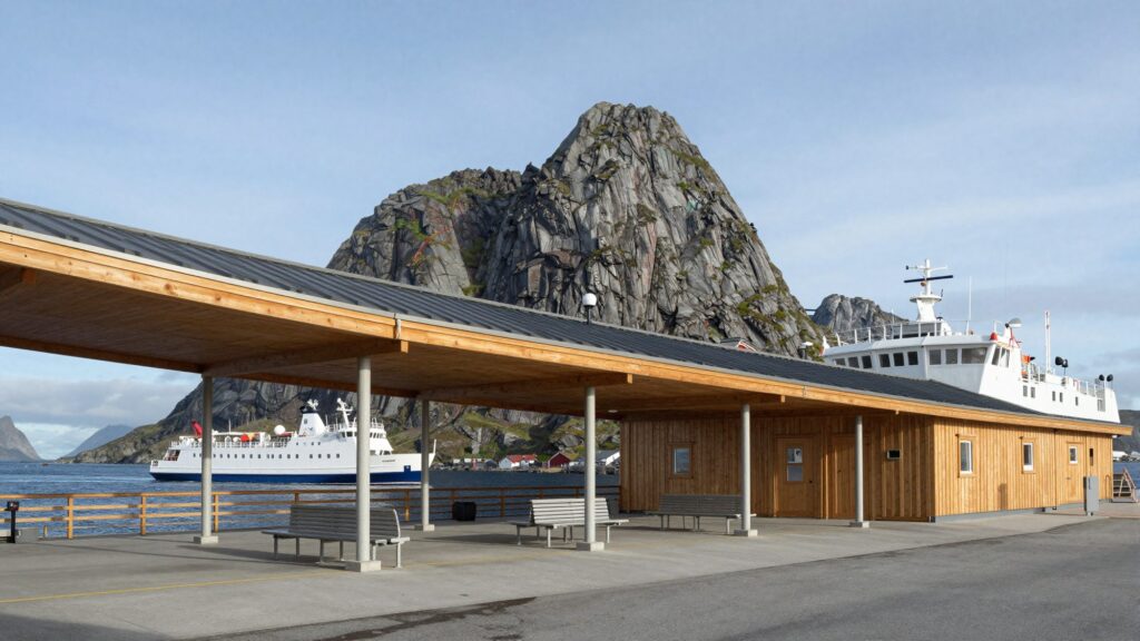
Sørbø Ferry Terminal
Sørbø · 2019
Read the transcript
On screen: “Scroll down. Move sideways.” On the Vatn Architects demo, the row of project cards – Sea Cabin, Havnvik Library, Kaikanten Housing and the rest – slides to the left as the page scrolls down. On screen: “One scroll, two directions.”
What is a horizontal scroll section?
A horizontal scroll section is a row of panels – project cards, product details, steps – that moves sideways while the visitor scrolls down. The section stays on screen until the row has run its course, then the page carries on. Visitors scroll as they always do; only the direction changes.
Scroll-driven section, swipe row or slider: three things called “horizontal scroll”
- Scroll-driven section. The page’s own scrolling moves the row, and the section holds while it does – the idea behind a pinned scene in steps, turned sideways. In Midground, this is the Horizontal sequence.
- Swipe row. A row you scroll sideways yourself, with a thumb or a trackpad, while the page scrolls normally. The Horizontal sequence becomes one on phones and for visitors who prefer reduced motion.
- Slider. Slides you step through with arrows or dots, sometimes on a timer – Midground’s Slider element, not this one.
Tables that scroll sideways on small screens are something else again, and so is big text that slides along as you scroll – that’s the Moving text band.
Good uses – and when to keep things vertical
A sideways row suits things people browse: projects, product details, a timeline, the steps of a process. Four to eight panels work best. On the four demo sites, Vatn uses one for its projects, Norn for close-ups of its headphones and Folk & Flint for a lookbook.
Keep the main message, long text, forms and anything visitors must not miss in the normal flow: what sits off screen is easy to skip. One row per page is usually plenty – with pinned scenes and parallax, it’s one of the building blocks of scrollytelling in WordPress.
How to build a horizontal scroll section in Midground
Step 1: Add a Horizontal sequence
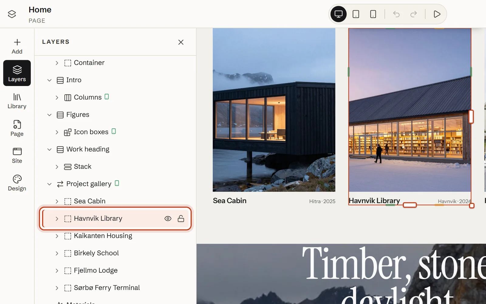
In Add, under Depth, motion & 3D, drag Horizontal sequence onto the page; it comes with four cards. Dropped on the page itself, it lands in a new section – for an edge-to-edge row like ours, choose Move out of parent under Element actions (…) and delete the empty section.
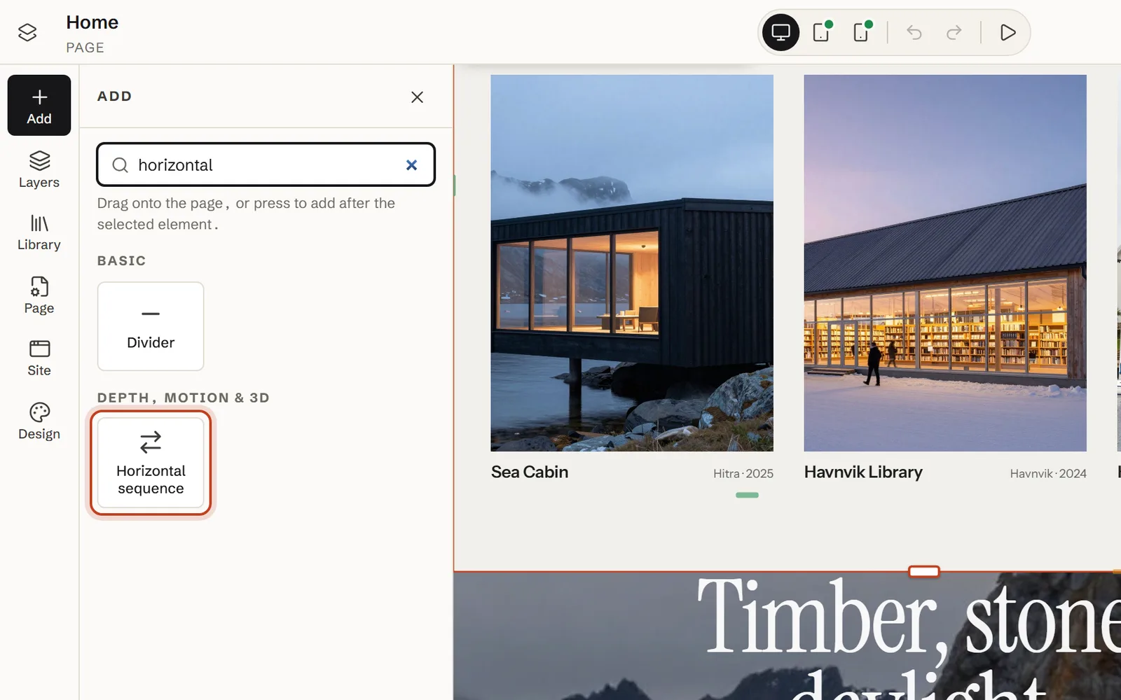
For a head start, Library → Sections has a ready-made Sideways gallery: a heading and four cards, already edge to edge.
Step 2: Fill it with panels
Each panel is an ordinary element: Add panel in the Content tab adds a card, and you can drag in a picture, a container or even a 3D model (see add a 3D model to WordPress). For panels that link somewhere, use a Card with a Card link: the whole card is clickable, and the link is named after its heading.
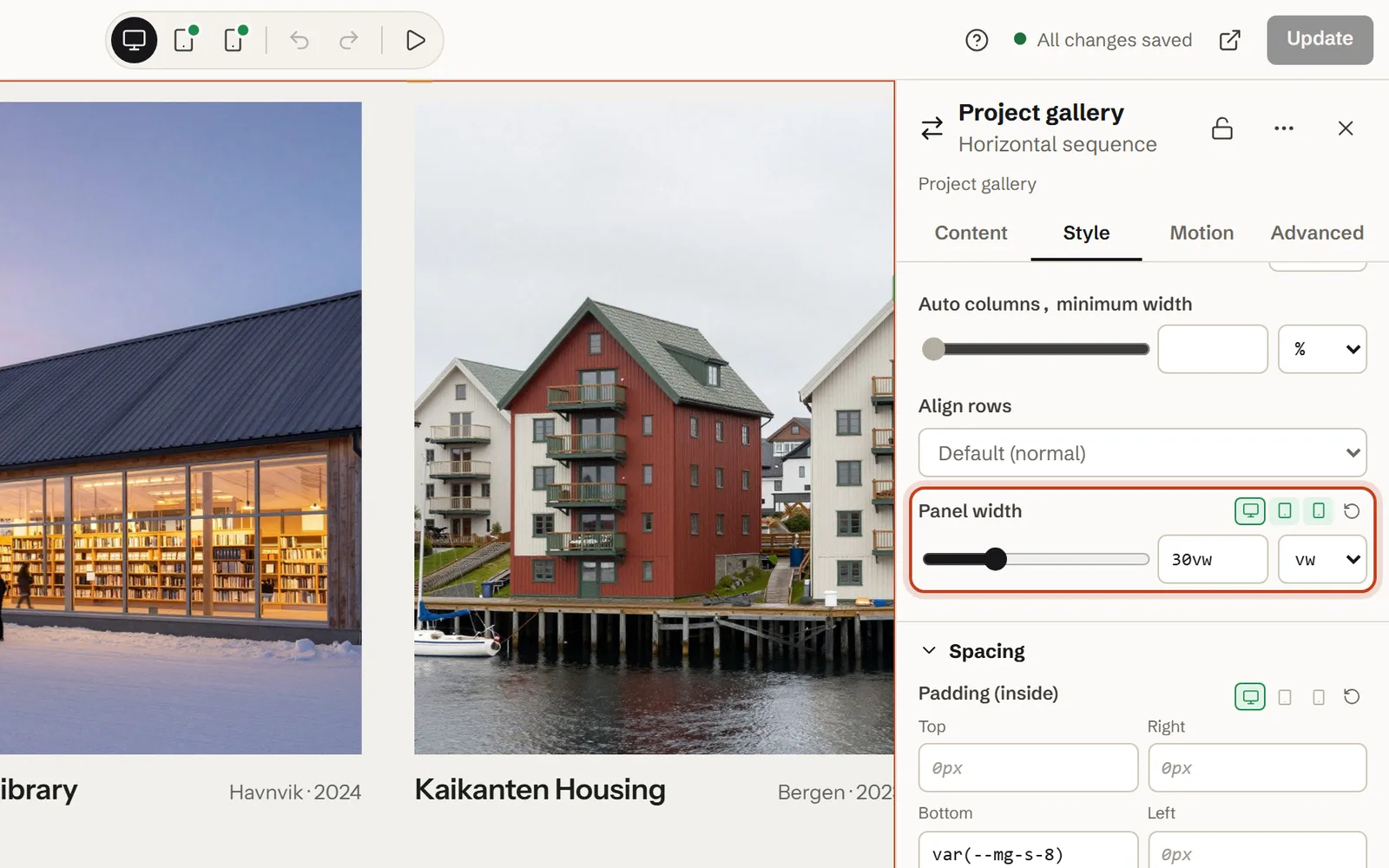
Step 3: Set the panel width and gap for each screen size
Select the Horizontal sequence, open Style → Layout and set Panel width on Desktop, Tablet and Phone in turn. Our demo uses 30vw, 46vw and 78vw – three cards at a time on a computer, two on a tablet, one plus the edge of the next on a phone – with Gap at Space 6.
Step 4: Name it for screen readers
In Content, replace the default Name for screen readers, “Highlights”, with what the row holds – ours is “Selected projects”. Screen readers announce the row as a region with that name, so it has to make sense on its own.
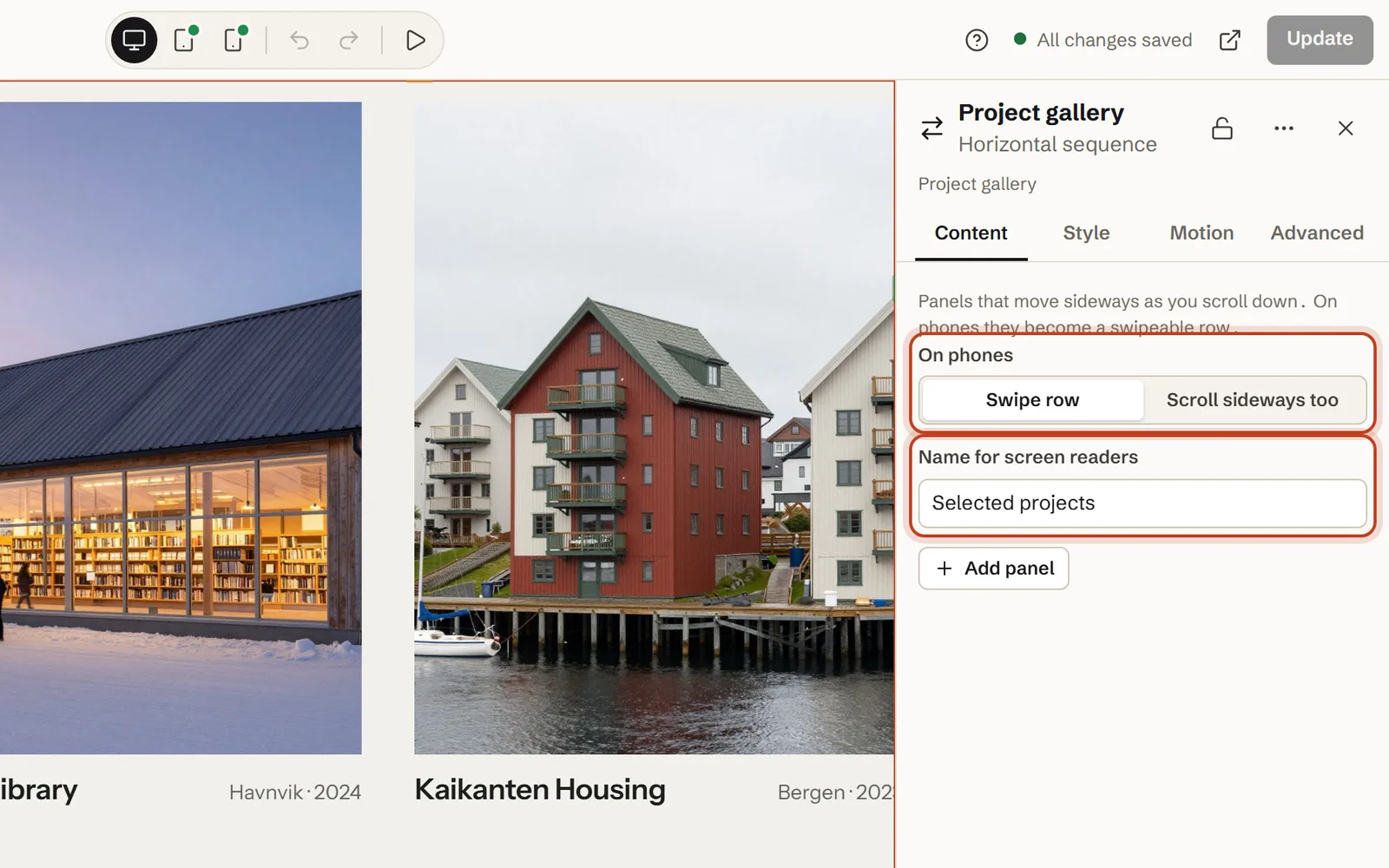
Step 5: Decide what phones get
On phones is Swipe row by default: below 768 px, the cards scroll under the thumb and snap into place while the page scrolls normally. Scroll sideways too keeps the scroll-driven version on phones as well.
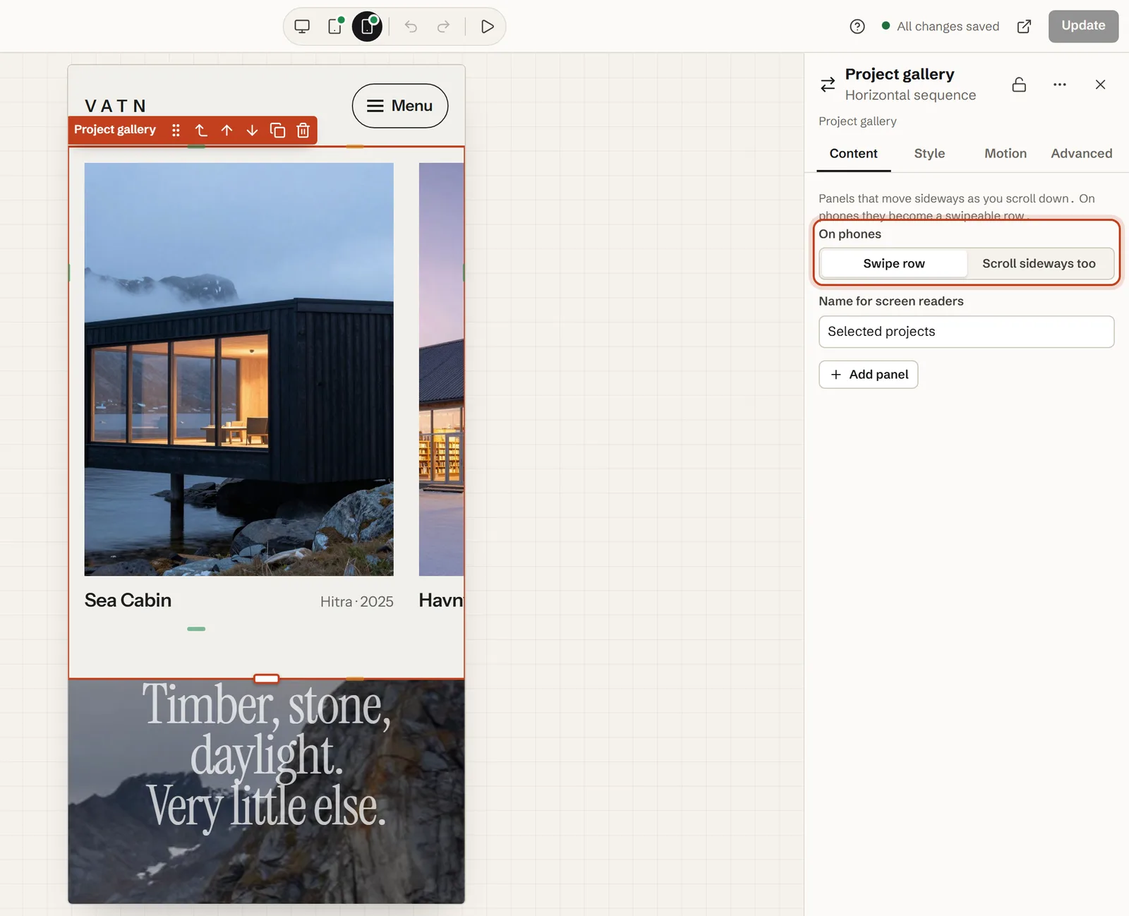
Step 6: Add a heading and a hint above it
Put a heading in a section just above the row, with a short line such as “Scroll to look closer →” (as on our Norn demo) or a link to the full list, like Vatn’s “All projects” button. The heading can have an effect of its own – see text reveal on scroll.
Step 7: Preview on every screen – and with the keyboard
The editor keeps the row a plain scrolling row, so you can reach every panel; Preview in a new tab shows it moving. Try it wide, in a narrow window, with your device set to reduced motion, and with the keyboard alone (see Accessibility).
The settings, explained
Every setting, with the values from our live demo – the project gallery from the Vatn Architects home page:
| Setting | What it does | In our demo |
|---|---|---|
| Panel width (Style → Layout) | How wide each panel is, per screen size. Default 42vw on desktop, 60vw on tablets and 82vw on phones. | 30vw · 46vw · 78vw |
| Gap (Style → Layout) | The space between panels, from your spacing scale. Default Space 6. | Space 6 |
| On phones (Content) | Swipe row: the row scrolls under the thumb and snaps to each panel. Scroll sideways too: the scroll-driven version on phones as well. | Swipe row |
| Name for screen readers (Content) | The name of the scrolling region. Default “Highlights” – change it. | “Selected projects” |
| Panels | Any elements. Add panel adds a card. | Six cards: a picture, the project, the place and the year |
How far the page scrolls: it measures itself
There is no length to set. Midground measures the row and holds the section for exactly as much scrolling as the row is wider than the section – for a full-width row, the screen. On a 1,440 px wide screen, our six 30vw cards are 432 px each; with five 40 px gaps and a 48 px side margin at each end, the row is 2,888 px wide. Minus the 1,440 px screen, that leaves 1,448 px of scrolling – about 1.6 screen heights in a 900 px tall window (measured on our demo on 4 October 2026).
At the default 42vw, the same six cards would hold the page for about 2,485 px, nearly 2.8 screen heights. Panel width and the number of panels are your scroll length.
What it doesn’t do (yet): the scroll-driven row follows the scroll one to one – no snapping, arrows or dots (the Slider has those) – and the left and right arrow keys don’t move it; the up and down keys do.
On phones and tablets
Below 768 px wide, the Horizontal sequence is a swipe row unless you choose otherwise. The cards move with the visitor’s thumb and snap into place one at a time, and the page scrolls as usual – nothing holds it. Let the next card peek in, as our 78vw does: the sliver at the edge tells people there is more.
Scroll sideways too keeps the scroll-driven version on phones. It works, but on a small screen the page then stands still while the thumb keeps scrolling down, which can feel stuck; for most rows the swipe row is the better choice.
Tablets, from 768 px up, get the scroll-driven version with their own panel width – 46vw on our demo, two cards at a time on a tablet held upright. Midground measures the row again when the screen turns or the window is resized.
Accessibility: keyboard, screen readers and reduced motion
A row that moves sideways is easy to get wrong for people who don’t use a mouse or can’t see the screen. Here is what the Horizontal sequence does for you, and what is left to you.
What Midground does
- A named region. The row is a region with the name from Name for screen readers, so screen readers can announce it, and their users can jump to it or past it.
- Reachable by keyboard. Tab reaches the row itself, outlined in your accent colour. In the scroll-driven version, the down and up arrows, Space and Page Down then move it, because they scroll the page; the left and right arrows don’t. In the swipe row, the left and right arrows scroll it a card at a time.
- Focus brings a card into view. In the scroll-driven version, when a link inside a card gets focus, Midground scrolls the page so that card is on screen.
- Real content, in order. Every card is ordinary HTML – headings, text, pictures with their alternative text, links – in the order you see in Layers, so screen readers read them all, including the ones off screen.
- A calm version. Visitors who ask their device for reduced motion get the swipe row on every screen. Without JavaScript, the row is a swipe row too.
What is up to you
- Change the name from “Highlights” to what the row holds.
- Show that there is more: a line above the row, and a phone panel width that lets the next card peek in.
- Keep anything visitors need outside the row, and link to the full list. Adrian Roselli’s Horizontal Scrolling Containers Are Not a Content Strategy is worth reading before you put anything important in one.
- Give pictures alternative text in the Image element, or turn on Decorative (hide from screen readers). A Card’s own picture counts as decorative, so let its heading say what it shows. Our other accessibility habits apply too.
Performance
There is no GSAP or ScrollTrigger to load. One small script runs Midground’s motion – about 12.5 KB of JavaScript (compressed) before interaction on our demo – and it loads only on pages that need it.
The holding is plain CSS, position: sticky. While the section holds, a passive scroll listener moves the row with a transform, so the browser doesn’t lay out the page again as it moves, and nothing takes over the mouse wheel or the trackpad – the page scrolls at the visitor’s own speed. The swipe row is the browser’s own scrolling with CSS scroll snap; no script runs while it moves.
The cards are ordinary WordPress text and images. If the row opens the page, turn on Load first (image near the top of the page) for the first card’s picture. For the other effects, see everything Midground can do.
Common mistakes (and fixes)
The section scrolls for too long
Too many panels, or panels too wide: the scroll length is the row’s width minus the screen’s. Cut to four to eight panels or narrow them – on our demo, 30vw instead of the default 42vw takes the section from about 2.8 to 1.6 screen heights.
Nothing moves, and there is empty space around the row
If all the panels fit on the screen, there is nothing to move, but the section still stands one screen high with the row in the middle. Add panels or widen them – or use a Grid instead.
The section doesn’t hold, or lets go early
Holding needs every element around the sequence to let the page scroll normally; a wrapper with overflow: hidden – often a theme’s content column – stops it. Choose the Full width layout in the Page panel, or ask the theme’s developer for overflow-x: clip, which doesn’t get in the way. Padding on the Horizontal sequence itself is part of its height, so the section starts to leave that much before the last card is in: put the space in the next section, or use Margin (outside).
It’s a swipe row on your computer
One of three things: your device asks for reduced motion (on a Mac, Reduce motion; on Windows, Animation effects off), Site-wide motion in Design is Reduced for all or Off, or the window is under 768 px wide.
Cards hide under a sticky header
The held row sits in the middle of a screen-high stage, so a fixed header covers the top of tall cards on short laptop screens. Keep the cards no taller than the window’s height minus twice the header’s; a narrower panel or a landscape picture makes them shorter.
Text inside the cards is cut off
While it holds, the row is exactly one screen high, and anything taller is cut off at the top and bottom. Keep each card to a title and a line or two; the rest belongs on the page it links to.
It doesn’t move in the editor
That’s on purpose: in the editor the row is a plain scrolling row, so you can select and change every panel. Preview in a new tab shows the real thing.
Let an AI agent build it
From Midground 1.2, AI agents such as Claude Code, Cursor and Codex can build Midground pages through the WordPress MCP Adapter. Describe the row, and the agent makes a draft for you to check in the editor – see how to let an AI agent build it.
Prompt for your AI agent
Using Midground, make a draft page “Projects” with the heading “Selected work” and, under it, a horizontal sequence of six cards: a project picture, the project’s name as the heading, the place and year, and a card link to the project. Panel width 30vw on desktop, 46vw on tablets and 78vw on phones, a swipe row on phones, named “Selected projects” for screen readers. Send me the preview link.
The code way: GSAP ScrollTrigger or CSS scroll snap
By hand, the usual way is GSAP’s ScrollTrigger: pin the section and move the row by as much as it overflows.
gsap.registerPlugin(ScrollTrigger);
const section = document.querySelector('.gallery');
const track = section.querySelector('.gallery__track');
const distance = () => track.scrollWidth - section.clientWidth;

gsap.matchMedia().add('(min-width: 768px) and (prefers-reduced-motion: no-preference)', () => {
  gsap.to(track, {
    x: () => -distance(),
    ease: 'none',
    scrollTrigger: {
      trigger: section,
      start: 'top top',
      end: () => '+=' + distance(),
      pin: true,
      scrub: true,
      invalidateOnRefresh: true
    }
  });
});
The swipe row alone is plain CSS:
.gallery__track {
  display: flex;
  gap: 1.5rem;
  overflow-x: auto;
  scroll-snap-type: x mandatory;
}
.gallery__track > * {
  flex: 0 0 78vw;
  scroll-snap-align: start;
}
What you then look after yourself: loading the scripts in WordPress (wp_enqueue_script), a focusable, named region for keyboard and screen-reader users, bringing a focused card into view, measuring again when the window or the content changes, the phone version, reduced motion, and theme CSS that breaks pinning. Check the code against GSAP’s current documentation before you ship it.
Questions about horizontal scroll
Can I make a horizontal scroll section in WordPress without code?
Not with WordPress’s own blocks: none of them turns vertical scrolling into sideways movement, so you would write CSS and JavaScript, for example with GSAP’s ScrollTrigger. In Midground it’s one element, the Horizontal sequence, set up in the visual editor.
How does horizontal scrolling work on phones?
Phones get a swipe row by default: the cards move with the visitor’s thumb and snap into place, while the page itself scrolls normally. Choose Scroll sideways too to keep the scroll-driven version on phones. Tablets, from 768 px wide, get the scroll-driven version.
Is horizontal scrolling bad for usability or accessibility?
It can be, when it hides content people need. Use it for things visitors browse – projects, product details, steps – and keep the key message outside it. Midground’s row is a named region the keyboard can reach: the down arrow and Space move it, a focused link brings its card into view, and visitors who prefer reduced motion get a swipe row.
How far does the page scroll in a horizontal section?
As far as the row is wider than the section – for a full-width row, the screen. Midground measures it, so there is no length to set or guess. On our demo that is 1,448 px of scrolling at 1440 × 900; fewer or narrower panels make it shorter.
Can I make a whole website scroll sideways?
Not as a whole site: the Horizontal sequence is one section inside an ordinary vertical page. The page holds while the row moves sideways, then scrolls on, so menus, text and the footer behave as visitors expect, and search engines read every card. Use it for the part that should move sideways, such as a project gallery.
Can I use it for a portfolio or product gallery?
Yes. Each panel is an ordinary element – usually a card with a picture, a title, a line of text and a link – so it works for projects, products, team members or a timeline. Four to eight panels work best; link to the full list for the rest.
Can I add a horizontal scroll section in Elementor?
Yes – Elementor’s free Shortcode widget is enough, no Elementor Pro or add-on pack. Build the section in Midground, save it as a component, and place its shortcode in the widget, or use the Midground section block in the block editor. It works next to your current theme and brings its motion and styles along; if it doesn’t hold there, see the common mistakes.
Will Google index the cards?
Yes. The cards are ordinary HTML text, links and images in the page; the sideways movement is only a visual effect.
About the author. Pelle Nilsen makes Midground – a solo developer in Norway. Every demo in this guide was built in the same editor you can open in your browser. Questions or corrections: hello@midgroundwp.com. More about Midground.
Take this demo apart in your browser
Remix opens the editor with a full copy of the Vatn demo site, in your browser – no sign-up, nothing to install. Change the settings from this guide and watch what happens.
More guides