Midground user guide
Midground is a WordPress theme (Midground) and a visual page builder (Midground Builder). Together they let you build pages, headers, footers and templates by dragging elements onto the real page, give layers depth, add scroll-driven motion and show 3D models – without locking your content into the tool.
The interface is available in English and Norwegian (Bokmål); it follows the language of your WordPress profile.
- 1. Getting started
- 2. The editor
- 3. Style, screen sizes and the site's design
- 4. The elements
- 5. Motion
- 6. Depth, parallax and pinned scenes
- 7. 3D models
- 8. Background video and consent
- 9. Maps, reviews, forms and booking
- 10. Popups and the announcement bar
- 11. Components
- 12. Header, footer and templates
- 13. Search engines (SEO)
- 14. Sites in several languages
- 15. Client mode
- 16. Export and import
- 17. The AI assistant
- 18. WooCommerce
- 19. Saving, revisions and the safety net
- 20. Pages that already have content
- 21. If the plugin or the theme is switched off
- 22. Settings, API keys and the licence
- 23. Accessibility: good habits
1. Getting started #
- Install and activate the theme Midground (Appearance → Themes → Add → Upload) and the plugin Midground Builder (Plugins → Add → Upload). WooCommerce is optional.
- The first time Midground Builder runs, it creates a simple header and footer for your site. You can change them at once, or replace them with a starter site.
- Optional: activate Midground Demo Content and open Midground → Starter sites.
- Open a page and choose Edit with Midground (in the page list, in the admin bar or in the block editor), or start a new one with Midground → Start → New page with Midground.
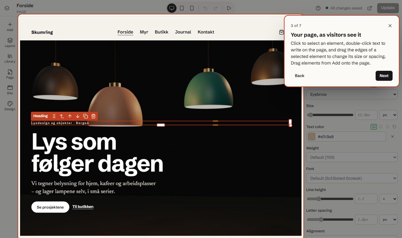
The first time you open the editor, a one-minute tour shows you around. You can take it again from the Help menu (the question mark at the top), which also has the keyboard shortcuts and a link to this guide.
Starter sites #
Midground → Starter sites has complete sites to start from. Each one brings pages, a header, a footer, menus, colours, fonts and type sizes:
| Starter site | For | Shows |
|---|---|---|
| Northlight Studio | Agencies and portfolios | Text that rises in word by word, a scrolling text band, client logos, hover effects, team page |
| Ember & Oak | Restaurants and cafés | Menu in tabs, opening hours, table booking, dish slider, guest reviews, private dining popup, announcement bar |
| Fieldhouse Goods | Online shops (needs WooCommerce) | Categories, featured products, sale countdown, reviews carousel, help page, product and shop templates |
| Brightwater Plumbing | Local businesses | Services, fixed prices, key figures that count up, reviews, service area, quote page |
| Tidewater Tours | Experiences and activities | Tours with booking in a window, countdown to the season, horizontal sequence of pictures, featured reviews |
| Loopwise | Apps and software | Screenshot that tilts towards the pointer, customer logos, features, plans, reviews, a corner popup |
| Skumring | A showcase in Norwegian | 3D models, parallax and a pinned story, a small shop with variable products, journal posts |
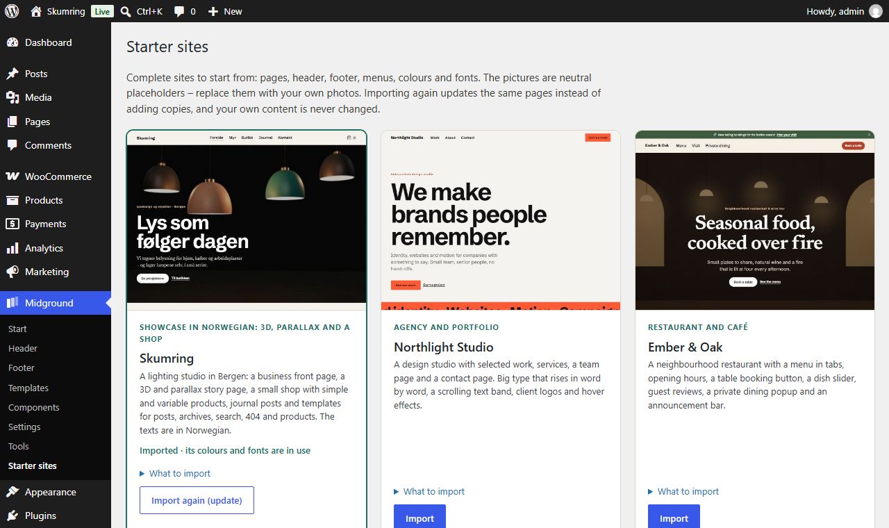
Under What to import you choose the parts: the site title, front page and menus; the header, footer and templates; the colours, fonts and type sizes; and whether its Google fonts are copied to your site (they are then served from your own server – visitors never contact Google). The pictures are neutral placeholders: replace them with your own photos. Their alternative text says what each picture should show.
Importing again updates the same pages instead of adding copies, and your own content is never changed. When you import a second starter site, its header, footer and templates take over and the earlier ones become drafts. Remove moves a starter site's pages, posts, products and templates to the trash, deletes its menus and puts your earlier colours and fonts back. Its pictures stay in the media library.
2. The editor #
| Area | What is there |
|---|---|
| Left rail | Add (elements), Layers (the tree of everything on the page), Library (ready-made sections, page layouts and your components), Page (page settings, search engines, revisions, original content), Site (header, footer and templates) and Design (colours, fonts and more for the whole site) |
| Middle | The canvas: the real page with the theme, header and footer |
| Right | Settings for the selected element: Content, Style, Motion, Advanced |
| Top | Menu, title, screen size (desktop, tablet, phone), undo/redo, motion preview, Help, save status, preview, Save draft and Publish / Update |
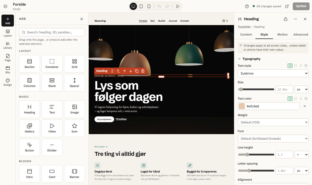
Adding elements: drag an element from Add onto the canvas (a line shows where it will land), or click it – it is added after the selected element. Content dropped straight onto the page gets a section around it. Library has whole sections (heroes, features, prices, questions and answers, contact, headers, footers …) that you can adapt.
Selecting: click an element on the canvas or in Layers. The path at the top of the settings ("Section › Container › Heading") takes you to the parents. The small toolbar above the selected element moves it up or down, selects the parent, duplicates and deletes it.
Size and spacing by dragging: a selected element has handles on its edges. Drag the right edge to change the width (it snaps to halves, thirds and quarters; hold Shift for any value), the bottom edge for the height where that makes sense, and the coloured bands for the inner spacing (padding) and the space above and below (margin). Hold Alt to change both sides at once. Double-click a handle to reset it. Dragging changes the value for the screen size you are looking at.
Writing text: double-click text on the canvas (on a phone: double-tap) to write on the page. A toolbar appears with paragraph and heading levels, bold, italic, underline, strike-through, lists, quote, link, alignment and colours from your design. The same editor, with an HTML view, is in the Content settings. When you turn a paragraph in a text element into a heading, Midground makes it a separate Heading element, so it can be styled and moved on its own.
Layers: the whole tree. Drag rows to move elements, also into and out of containers. Double-click (or F2) renames. The eye hides an element (it stays in the document), the padlock stops it from being moved or deleted. A green dot shows that an element has its own settings on some screen sizes.
Keyboard: Ctrl+Z / Ctrl+Shift+Z undo and redo, Ctrl+S saves, Ctrl+D duplicates, Ctrl+C / Ctrl+X / Ctrl+V copy, cut and paste, Delete deletes, Esc selects the parent. In Layers, Alt+↑/↓ moves the element, Alt+→ puts it inside the element above, Alt+← takes it out. 1, 2 and 3 switch between desktop, tablet and phone. Press ? for the full list.
Phones and tablets: on narrow screens the tools are in a bar at the bottom (Add, Layers, Settings, Page). Everything works without dragging: use the arrows in the element toolbar or Element actions (…) in the settings.
3. Style, screen sizes and the site's design #
Style has size, layout, spacing, typography, background, border and corners, position, appearance and hover. Number fields have a slider, a number and a unit (px, rem, %, vh …); you can also type clamp() or pick one of your design values. Fields that you have not set show the value that applies now in grey, so you can see what you are changing from.
Screen sizes: choose desktop, tablet or phone at the top before you change a value. Changes on tablet and phone apply there and on smaller screens only. A green dot marks values that differ on a screen size – next to the field (click it to jump to that size or to reset the value), on the screen-size buttons when the selected element has its own values there, and in Layers. Advanced can hide an element on some screen sizes.
The desktop view always shows the page at desktop width (scaled down when the window is narrow), so you see exactly what visitors on a computer see.
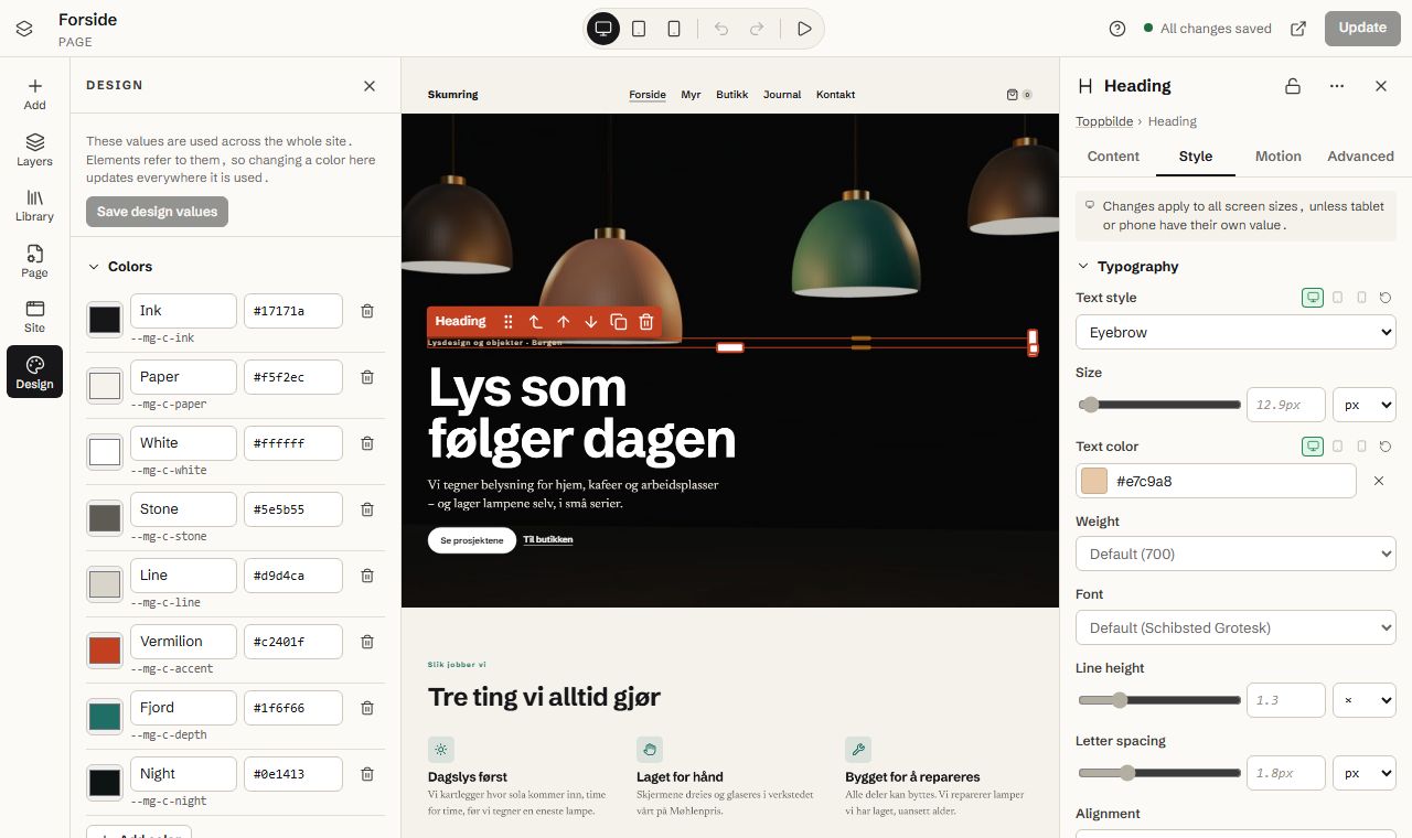
Design (left rail) holds the design values for the whole site:
- Colors – named colours used everywhere (text, background, accent, lines …).
- Fonts – for headings, body text and interface labels. Add fonts opens the Google Fonts catalogue: choose a family and its styles, and Midground copies the font files to your site (WordPress's font library). Visitors load them from your server, not from Google.
- Text styles – display, headings, lead, body, small and eyebrow. Sizes grow smoothly from the phone size to the desktop size.
- Spacing scale, Corners & shadows and Layout (content width, reading width, side margins).
- Motion – full, reduced for all, or off; default strength on phones and tablets; and Between pages: instant, fade or slide (page transitions in browsers that support them).
Changes show at once on the canvas; Save design values applies them to every page, template and the theme.
4. The elements #
| Group | Elements |
|---|---|
| Layout | Section, Container, Grid, Columns, Stack, Spacer |
| Basic | Heading, Text, Image, Gallery, Video, Icon, Button, Divider |
| Blocks | Hero, Card, Banner, Quote, Price list, Call to action, Feature, Icon box and Icon boxes, Slider, Countdown, Logo band, Reviews |
| Navigation & interaction | Popup, Map, Language switcher, Announcement bar, Tabs, Accordion, Menu, Breadcrumbs, Search |
| Posts & dynamic data | Post list, Post title, Post content, Featured image, Post info, Comments, Archive header |
| Shop (WooCommerce) | Products, Product info, Price, Buy buttons, Product images, Product details tabs, Cart link |
| Depth, motion & 3D | Depth group, Layer, Parallax section, Scroll motion, Pinned scene, Horizontal sequence, 3D model, Moving text band |
| Utility | Form, Booking, Component, Kept content, Custom HTML, Shortcode |
Highlights:
- Icon box / Icon boxes: an icon with a title and text – as a pill, a card, simple, or a key figure whose number counts up when it comes into view. Icon above or beside the text. The group shares one style; add, remove and reorder boxes like any element.
- Reviews: a compact summary (stars, score, number of reviews), cards in a list or grid, a carousel or one featured quote. Write reviews yourself, or show your Google or Trustpilot reviews with your own key (see section 9).
- Slider: slides of pictures or whole sections, 1–4 per view (and a different number on phones), arrows, dots and optional autoplay that pauses on hover and focus.
- Countdown: to a date and time, or a number of minutes from each visitor's first visit; boxes or inline; a message when it ends.
- Logo band: logos that glide by (greyscale until hovered, faded edges). Moving text band: big text that moves with the scrolling, filled or outlined.
5. Motion #
Select an element and open the Motion tab, then pick an effect. The effects are grouped:
- Enter: Rise in, Fade in, Slide from left or right, Zoom in, Tilt up, Swing open, Wipe reveal.
- While scrolling: Parallax drift, Float up, Glide sideways, Turn, Orbit in 3D, Grow, Spotlight.
- Exit: Fade out, Lift away.
- Appear once: rise, fade or zoom the first time the element comes into view.
- Text reveal: words rise in, letters rise in, words fade in, or words come into focus.
- On hover: lift, zoom, 3D tilt or magnetic.
- Follow pointer: tilt towards the pointer, drift with the pointer.
For each effect you choose when it runs, its strength (0–200 %), and where in the scroll it starts and ends. The diagram shows the scroll range – drag in it to preview. Per device turns the effect down on tablets and phones (85 % and 60 % by default; 0 % turns it off). Keyframes (advanced) lets you build your own. Combine with another effect adds a second one; movements and rotations add up, scale and opacity multiply.
Visitors who have asked their device for reduced motion get a calm page where everything is shown at rest. You can preview that in the editor from the motion menu at the top, and pause motion while you edit.
6. Depth, parallax and pinned scenes #
- Depth group: stack layers at different depths (−100 to 100); layers further back move more slowly as the page scrolls. Depth view tilts the group in 3D so you can see and drag the layers.
- Parallax section: a background picture or video that moves more slowly than the content.
- Pinned scene: the section stays in place while visitors scroll through its "acts"; the content changes with the progress. On phones and tablets you choose whether the scene stays pinned or shows the acts one after the other.
- Horizontal sequence: cards that glide sideways while the page scrolls (swipe on phones).
- Scroll motion: moves, turns, scales and fades its content as it scrolls through the screen.
7. 3D models #
Add 3D model and choose a .glb file from the media library (uploads are checked to be valid, self-contained glTF 2.0 files). Set the camera, the lights (studio, soft daylight, dusk, night or flat), the background, whether visitors can turn the model, and how it turns and moves with the scrolling. Capture poster from the canvas saves a still picture of the current view.
The poster and the description matter: they show while the model loads, on devices without WebGL and if the model cannot be loaded. Models load when they come near the screen and draw only when something changes. On phones you can choose a lighter rendering or just the poster. Keep files small (under 2 MB; Draco or meshopt compression loads fastest). Models from other websites must be allowed by an administrator under Midground → Settings.
8. Background video and consent #
Sections, heroes, containers and other boxes can have a background video (Style → Background): a video file from the media library, a link to an MP4 or WebM file, or a YouTube or Vimeo address. Add a poster image: it shows while the video loads, for visitors who prefer reduced motion and where the video does not play. On phones you choose between the video, the poster or nothing – the poster saves data and battery. The overlay colour and its opacity are drawn on top of the video.
Videos from YouTube and Vimeo (and Google Maps) set cookies, so they only load after the visitor agrees. Under Midground → Settings → Videos from YouTube and Vimeo you choose:
- Midground's own small notice (recommended without a cookie plugin) – the poster shows with a short note and a button to play the video. The answer is remembered. A link to
#mg-consent(for example in your privacy policy) lets visitors change their answer. - Let your cookie plugin ask – when Complianz, CookieYes, Cookiebot, Borlabs Cookie, Real Cookie Banner or another plugin that uses the WP Consent API is active, Midground offers to let it decide (marketing category), with one click.
- Load without asking – only if your site handles consent in another way.
Videos from your own media library need no consent.
9. Maps, reviews, forms and booking #
Map: type an address and pick the right place. OpenStreetMap needs no key. Google Maps uses your own Maps Embed API key (see section 22). Both load after the visitor agrees, with a link to open the map on the service instead.
Reviews from Google or Trustpilot: add your key under Midground → Settings, then set the Reviews element's source and your place or business unit id. Your server fetches the reviews and keeps a copy for a while, so visitors never contact the service. Google gives up to five reviews.
Form: shows a form made with Gravity Forms, Contact Form 7, WPForms, Fluent Forms or Ninja Forms, styled to match your design (Style the form like the site can be turned off to keep the form plugin's own look). The form plugin still handles the entries, e-mails and spam protection.
Booking: a button that opens your booking page in a window on your site (or in a new tab), or the booking page shown on the page itself – for example Calendly, SimplyBook.me, Timely, Bókun or FareHarbor. Or show the booking form from a WordPress booking plugin: Amelia, Bookly, Simply Schedule Appointments, BookingPress or LatePoint. Booking pages from other services also load only after the visitor agrees when consent is required.
10. Popups and the announcement bar #
A Popup holds any content and opens from a link (link to the popup's address, shown on the canvas, such as #private-dining), after some seconds, when the visitor has scrolled a part of the page, or when they are about to leave (on computers). It can sit in the middle, in a corner or at the bottom, and you choose how often a visitor sees it again. Popups are real dialogs: they can be closed with Esc, keep the keyboard inside and give focus back when closed.
The Announcement bar is a slim line with a short message, an optional icon and a link – usually at the top of the header. Visitors can close it; you choose for how many days it stays closed.
11. Components #
Select an element and choose Save as component (Ctrl+Shift+S or Element actions). Insert the component anywhere from Library → Components. When you change the component, every copy changes. In a single copy you can change texts and settings locally and reset them again. Detach copy turns a copy into ordinary elements that no longer follow the component.
12. Header, footer and templates #
The header and footer are templates too. You can reach them in three ways:
- Midground → Header and Midground → Footer in the admin menu,
- the Site tab in the editor (with all templates and links to menus and the site identity),
- clicking the header or footer on the canvas, which shows Edit header / Edit footer.
In the header's settings, Stick to the top while scrolling keeps it in view. On a page with a large picture or film at the top, turn on Header over the first section (transparent header) in that page's settings: the header then lies see-through over the first section, with light text, and gets its own background back as soon as the visitor scrolls.
Midground → Templates also has templates for single posts, pages, archives and the blog, search results, "page not found", products and the shop. A template is edited like a page and previewed with real content (Template → Preview with). The elements under Posts & dynamic data, and dynamic fields in texts and links, fill in the content.
Where it shows: add rules ("Show on" and "Except"): the whole site, the front page, all posts, one post, posts in a category, archives and so on. More specific rules win (one post beats all posts, which beats the whole site). When two templates are equally specific, Priority decides; otherwise the most recently changed one is used, and both show a warning. A template applies once it is published.
13. Search engines (SEO) #
Page → Search and sharing has the title and description shown in search results, a picture for sharing on social media, Hide this page from search engines, and a preview of how the result may look. Midground fills in sensible defaults from the page (its first heading and paragraph). When Yoast SEO, Rank Math or SEOPress is active, the tab steps aside and points to that plugin instead – those plugins read the Midground content of the page for their analysis.
Questions and answers (an Accordion with Mark up as FAQ for search engines) are also described for search engines.
14. Sites in several languages #
With WPML or Polylang, each translation of a page has its own Midground document. A new translation starts as a copy of the original layout; open it and choose Edit with Midground to translate its texts. Later changes to one language do not overwrite the others. Templates and components can be translated the same way, and colour names are offered to WPML's string translation. The Language switcher element lists the languages as names or codes, inline or as a dropdown.
15. Client mode #
For agencies: under Midground → Settings → Client mode, choose the roles (for example Editor) that may change content only. People in those roles can change texts, pictures, links and lists in Midground, but not the layout, styles, motion or page settings, and locked elements stay locked. Administrators always have full access.
16. Export and import #
Midground → Tools exports pages, templates and components – optionally with the site's design values – to a file, and imports such a file on another site. Pictures can be linked to the original site or copied into the new site's media library. Components are brought along and linked correctly; templates arrive as drafts so nothing changes before you are ready. A single page can also be exported from the editor (Midground menu → Export to a file).
17. The AI assistant #
The AI assistant is off by default. An administrator can turn it on under Midground → Settings → AI assistant, choose the service (OpenAI, Anthropic or Google Gemini) and add their own API key for it. Usage is billed to that account; Midground has no keys of its own.
When it is on, text fields get a small sparkle button: Improve, Shorter, Friendlier, More formal, Fix spelling and grammar, Translate to another language, or Write new from a short description. For pictures it can Describe the image to suggest alternative text. You always see the suggestion first and choose Use this or Try again. Only the text of that field (or that picture) is sent, and only when you ask.
18. WooCommerce #
With WooCommerce active you get the shop elements and templates for products and the shop. They use real product data, including variable products (the price follows the chosen variation). Without WooCommerce none of this shows to visitors and the pages work as before.
Midground leaves WooCommerce's scripts and styles out of pages that have no shop content, which makes them load faster (Midground → Settings → WooCommerce, on by default). The shop, cart, checkout, account and any page with a shop element keep everything.
19. Saving, revisions and the safety net #
- Save draft and Publish / Update save. The status at the top shows whether everything is saved.
- Changes are autosaved a few seconds after you stop, without publishing. When you open the page again, you are offered to continue where you left off.
- If the connection drops, your work is kept in the browser and can be saved later.
- Every save is a revision (Midground menu → Revisions). A revision opens in the editor and can be undone before you save.
- If someone else is editing the page, you are told and can take over.
20. Pages that already have content #
When a page has content from the block editor or the classic editor, you can Convert to editable elements, Keep it as one block or Start empty. Converting shows a report of what becomes editable (headings, text, images, lists, quotes, buttons, columns, groups, covers, video …) and what is kept exactly as it was (unknown blocks, shortcodes, embeds) in a Kept content element. The result is shown before anything is saved. The original content is stored on the first save and can be restored exactly with Page → Original content → Restore original content.
If a Midground page is later changed in another editor, Midground notices the next time you open it and lets you import the changes.
21. If the plugin or the theme is switched off #
- Deactivating Midground Builder: every page keeps a readable HTML copy of its content (texts, pictures, links) that any theme can show. Motion, 3D and exact styling come back when the plugin is activated again. Nothing is deleted.
- Switching theme: Midground content keeps working with motion and 3D; the header and footer then come from the new theme (unless it supports Midground's header and footer).
- Deleting the plugin: pages and their content are kept. Templates, components and settings are deleted only if you ticked that under Midground → Settings → When the plugin is deleted.
- Coming from Kulisse 1.0 (Midground's earlier name): deactivate Kulisse Builder and activate Midground Builder – your pages, templates, components and settings are moved over automatically, and you are told when it is done.
22. Settings, API keys and the licence #
Midground → Settings has the content types you can build with Midground, the largest 3D model upload and hosts allowed for external models, WooCommerce script loading, client mode, consent for videos from other services, the AI assistant and what happens when the plugin is deleted.
Your own API keys: features that use another company's service need a key from your own account with that service – Midground has no keys of its own and sends nothing anywhere unless you use such a feature:
| Key | Used by |
|---|---|
| Google Maps (Maps Embed API) | The Map element with Google Maps. The key is visible in the page, as with every Google map – restrict it to your domain and to the Maps Embed API. |
| Google reviews (Places API) | The Reviews element with Google. Used only by your server. |
| Trustpilot | The Reviews element with Trustpilot. Needs a Trustpilot plan with API access. |
| OpenAI, Anthropic, Google Gemini | The AI assistant. Usage is billed to your account. |
Keys are stored on your server and never shown in full again; the editor is only told whether a key is set.
Licence: enter your licence key and choose Activate to receive updates. Midground keeps working if the licence expires; only updates stop until you renew. Remove from this site frees the key for another site.
23. Accessibility: good habits #
Midground produces semantic HTML, visible keyboard focus and respects reduced motion. You help by: using heading levels in order, giving pictures alternative text (or marking them as decorative), describing 3D models, keeping enough contrast (use Link color for links on dark backgrounds), and never putting important information only in an animation, a video or a 3D view.